


 Sales:
  Customer Service:
Kitchen Backsplash Ideas: The Right Tile for Every Cabinet Color

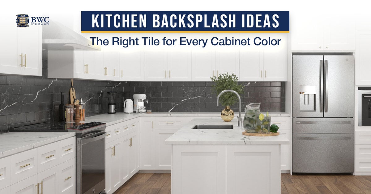
The most reliable kitchen backsplash ideas follow one rule: simple cabinet doors can carry a bold backsplash, while detailed doors need a quiet one. White or marble-look subway tile works with virtually every cabinet color, full-height stone slabs suit modern and two-tone kitchens, and hexagon mosaics with brass accent lines pair beautifully with both white and black cabinetry.
Choosing a backsplash sounds simple until you are staring at tile samples in a showroom. The right pairing comes down to one thing most people overlook: what already surrounds the wall you are tiling. Your cabinet color, door style, and countertop set the rules. The backsplash follows them.
This guide matches every major backsplash style, from subway tile to full-height slabs, to the cabinet colors each one works with, using pairings from our own kitchen designs.
Cabinet Color to Backsplash: Quick Pairing Reference
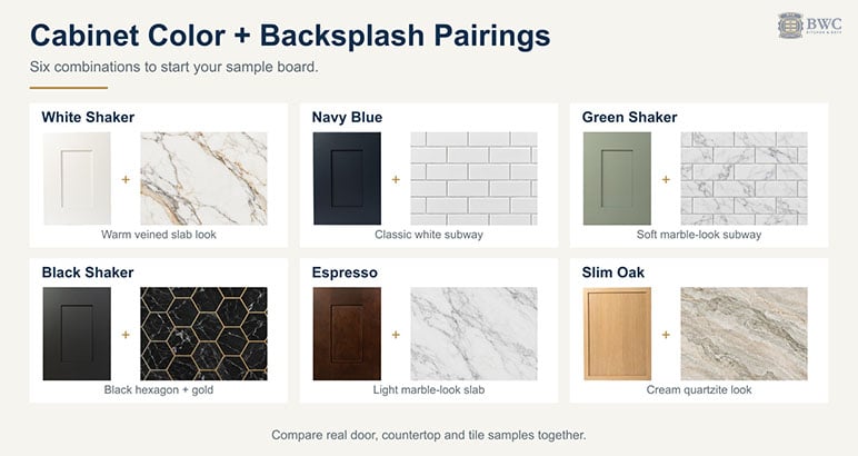
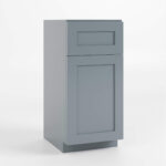
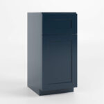
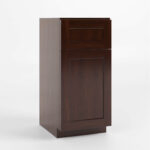
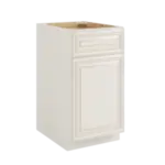
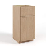
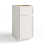
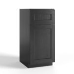
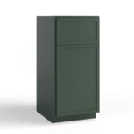
Explore the cabinet pairings: White Shaker, Navy Blue, Green Shaker, Black Shaker, Espresso, Slim Oak.
- White Shaker: Calacatta-look slab, marble hexagon with gold lines, or dark marble subway. Why it works: a simple door carries bold or quiet tile equally well.
- Navy Blue Shaker: white subway tile or full-height white marble slab. Why it works: clean contrast without competing for attention.
- Green Shaker (sage and olive tones): arabesque lattice, marble subway, or white hexagon with gold accents. Why it works: warm metallics bridge the green and the stone.
- Black and Charcoal Black Shaker: black hexagon with brass joints, Portoro-look slab, or veined marble subway. Why it works: tone-on-tone drama or light-tile contrast.
- Espresso Shaker: full-height light marble slab. Why it works: light stone keeps the dark wood from closing in.
- Slim Oak Shaker: full-height quartzite or onyx-look slab. Why it works: continuous stone lets vertical grain do the talking.
- Charleston White (raised panel): simple white brick-laid tile or a low-contrast woven mosaic. Why it works: detailed doors need a calm tile run.
- High Gloss slab doors: hexagon mosaic, black with gold or fine white picket. Why it works: texture offsets the flat reflective door.
Subway Tile Backsplash: Why It Still Works (and When It Does Not)
The subway tile backsplash has been the default kitchen backsplash idea for over a decade, and for good reason. A 3x6 white ceramic subway tile costs very little per square foot, installs cleanly, and pairs with nearly every cabinet color.
Best pairings:
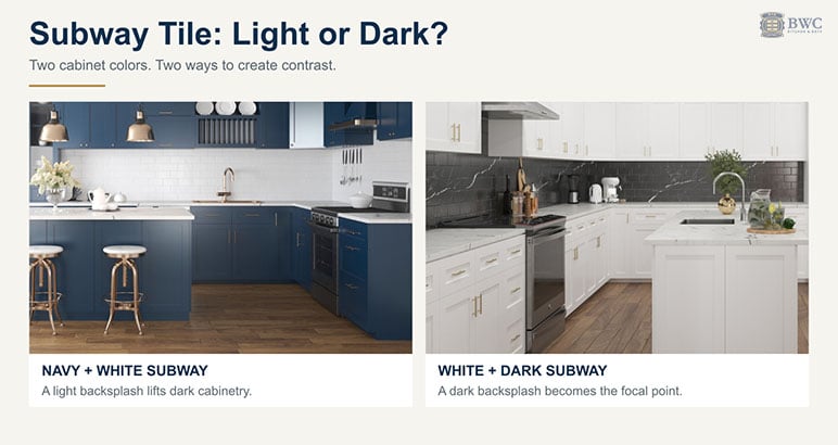
Navy Blue Shaker + white subway tile. In our navy kitchen designs, the glossy white brick-laid tile creates clean contrast without competing for attention, whether the perimeter is all navy or split navy-and-white. Browse navy blue shaker cabinets to see the door this pairing is built around.
White Shaker + dark marble-look subway tile flips the classic formula. In one of our white shaker cabinets designs, a glossy charcoal subway tile with white veining turns the backsplash into the statement wall, proof that white cabinets do not have to mean a white backsplash.
Charcoal Black Shaker + elongated marble-look subway in white and cream with soft veining keeps a dark kitchen bright where it matters most: between the counter and the uppers.
Slim Shaker Green + white marble subway tile with brass hardware is a pairing we use in our green kitchen designs. The veined stone tile reads richer than plain ceramic and ties into a white marble countertop.
Gray Shaker + white subway tile keeps the space soft and transitional, the lowest-risk pairing on this list.
Two-tone kitchens (dark uppers with natural wood bases) + white subway let the cabinet contrast be the feature while the tile stays quiet. Our guide to two-tone kitchen cabinets covers the color splits that work.
When it does not work: Subway tile with ornate raised-panel cabinet doors can feel like two different kitchens. The tile is modern and minimal. The door is traditional. If you love a Charleston White raised-panel door, choose a larger brick-format tile in the same white tone. Laid in the same running bond, it reads traditional rather than utilitarian. See the door style on our raised panel white cabinets category.
Will it age well? Yes. The 3x6 brick layout has been around since the early 1900s. That is not a trend, it is a standard. If plain white feels too safe, the fix is not the tile, it is the grout. A warm grey or charcoal grout line adds definition without adding cost, or you can step up to a marble-look subway for built-in movement.
Slab Backsplash: One Piece, Maximum Impact
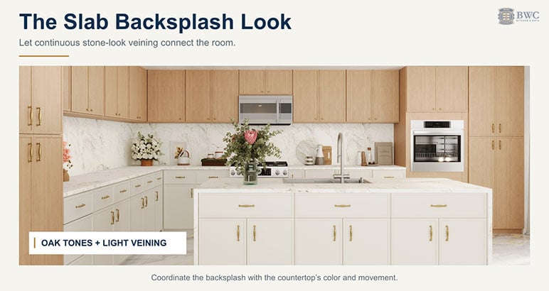
A slab backsplash uses a single piece of natural stone, porcelain, or engineered quartz that runs from countertop to upper cabinets, or all the way to the ceiling. No grout lines. No pattern interruption. It is the cleanest possible look.
Best pairings:
White Shaker + Calacatta-gold-look slab with warm gold and taupe veining is the high-end direction in our white kitchen designs. When the slab matches the countertop, and in one of our designs even a matching marble farmhouse sink, the room reads seamless and larger than it is.
Navy Blue and White Shaker + white marble slab delivers contrast that still reads sophisticated, and it suits two-tone layouts where the navy sits on the island or the lower run.
Espresso Shaker + light marble slab with grey-green veining creates dramatic contrast and keeps a dark wood kitchen from feeling heavy. The door tone is on our espresso shaker cabinets category.
Slim Oak Shaker + full-height quartzite-look slab in cream and greige is the heart of the warm organic-modern kitchen. In one of our designs, we ran a pale green onyx-look slab with floating organic veining behind natural oak, a Japandi statement that no tile can replicate. The vertical grain that makes it work is the signature of our slim oak shaker cabinets.
Black Shaker + black Portoro-look slab with bold gold veining is tone-on-tone drama for the moody luxe kitchen. Paired with a white-veined countertop, the room stays balanced.
Slim Shaker Green + dramatically veined marble slab behind the range gives a traditional farmhouse kitchen a serious focal point.
Honest take: Slab backsplashes are the most expensive option on this list. The material itself is not always the biggest cost; cutting, finishing edges, and templating add up. Budget for installation, not just material. If the budget is tight, porcelain slabs that mimic marble give you most of the look for less.
Will it age well? Yes. A slab backsplash has been a hallmark of high-end kitchens for decades. That is unlikely to change.
Hexagon Backsplash Mosaics: The Metallic-Accent Look
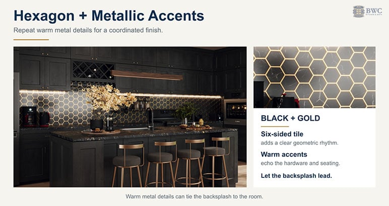
The hexagon backsplash, especially marble-look hexagons with brass or gold accent lines between them, has become the defining tile of the transitional-glam kitchen. Under LED under-cabinet lighting, the metallic joints catch light in a way flat tile cannot.
Best pairings:
White Shaker + white marble hexagon with gold accent lines works because the gold joints echo brass hardware and faucets, so the whole kitchen reads coordinated rather than matchy. An elongated picket (stretched hexagon) version of the same tile reads slightly more modern.
Black or Slim Black Shaker + black marble-look hexagon with brass joints is tone-on-tone luxury. With a black-and-gold Portoro-look countertop and under-cabinet lighting, the effect is a jewel box. Start with the door itself on our black shaker cabinets category.
High Gloss White slab doors + black hexagon with gold lines proves the contrast rule: flat handleless doors do nothing visually, which gives a bold dark mosaic room to be the statement.
High Gloss Gray slab doors + fine white marble hexagon keeps a sleek modern kitchen from feeling cold.
Green Shaker or Jade Green Shaker + creamy white hexagon with gold accents bridges the green paint and warm metallics beautifully.
Slim Oak and White two-tone + white hexagon with gold lines adds just enough sparkle to a Scandinavian-leaning kitchen.
Dorian Gray + mustard-gold picket tile is the boldest pairing in this guide, a warm golden feature wall against greige cabinets, for the homeowner who wants the backsplash to lead.
When it does not work: Skip the metallic accent lines if your hardware is matte black or stainless-only. Gold joints next to cool-toned hardware read accidental. Match the accent metal to the dominant hardware finish.
Will it age well? The hexagon shape itself is a classic, used in mosaic floors for a century. The metallic-joint version is newer. Treat it as a 10-year look, not a 50-year one. If you want maximum longevity, choose the same hexagon with a tone-matched grout instead.
Patterned Mosaics: Herringbone, Chevron, Arabesque, and Basketweave
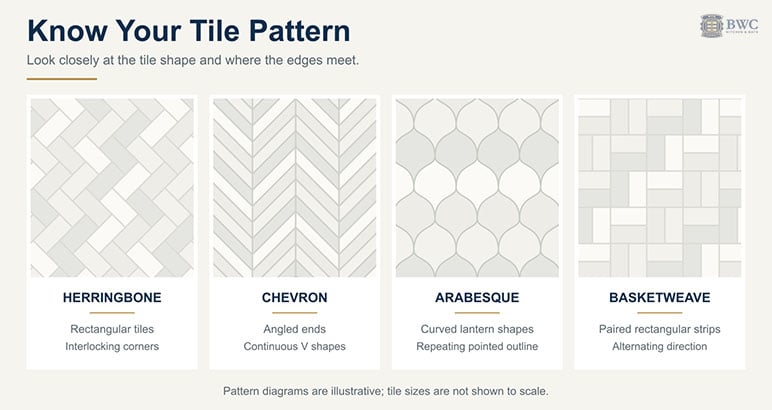
Patterned tile is where personality enters the kitchen. It can also be where regret enters the kitchen if the pairing is wrong.
The rule: bold backsplash plus simple cabinets. Almost always.
Herringbone vs chevron: Herringbone uses plain rectangular tiles, usually subway or elongated marble-look tile, laid so the end of each tile meets the side of the next in a zigzag. Chevron looks similar, but its tiles are cut at an angle so the ends meet in a clean point and form continuous V shapes. Herringbone reads a little softer and more traditional; chevron reads sharper and more modern.
Best pairings:
White Shaker or Gray Shaker + white or marble-look subway laid in herringbone is the easiest way into pattern. It is the same tile as a classic subway backsplash, with far more movement, and it works best as a focal panel behind the range or across a wall with no upper cabinets. Plan for the extra cost: herringbone needs more cuts at the edges than a straight lay, so order extra tile and expect a higher labor quote.
Navy Blue and White Shaker + chevron marble mosaic in white, grey, and taupe works well in two-tone kitchens. The shaker door does little visually, which gives the directional pattern room to be the statement. Run it floor-to-ceiling behind the hood for full effect.
Green Shaker + white marble arabesque lattice is the sophisticated modern-farmhouse move. The pointed diamond pattern adds movement without adding color, so the sage-toned doors stay the star. The base color lives on our green shaker cabinets category.
Natural wood-tone Shaker (like our Treasure Chest finish) + white arabesque mosaic with gold detailing keeps the space bright while letting the wood grain do the talking.
Gray and White Shaker + ivory ledger-stone brick tile adds hand-laid texture to an airy farmhouse kitchen, pattern through relief rather than color.
The exception that proves the rule: In our Charleston White raised-panel kitchen design, we paired traditional doors with a blue-and-white basketweave mosaic, and it works, because the weave is low-contrast and tonal. If you pair a pattern with a detailed door, keep the palette to two quiet colors and let a marble panel behind the range calm the composition. A high-contrast pattern plus raised-panel doors still fails: both fight for attention, and nobody wins.
Will it age well? Marble mosaics in classic layouts (herringbone, chevron, arabesque, basketweave) age well because the material is timeless even when the layout is expressive. Trendy printed geometric patterns tend to timestamp a kitchen. Pattern through real stone, not through print, is the safer bet.
Marble and Natural Stone Backsplashes: The Investment Option
Marble, quartzite, and split-face stone bring texture and depth that flat ceramic cannot replicate. A marble backsplash, whether real stone or marble-look porcelain, adds movement through veining rather than pattern. Real stone also brings a higher price tag and maintenance requirements.
Best pairings:
White or Navy and White Shaker + Carrara-look marble, as subway, chevron, or hexagon mosaic, is a well-proven combination. The grey veining prevents a light kitchen from feeling flat.
Gray and White Shaker + tumbled ivory ledger stone works in farmhouse and Mediterranean-leaning kitchens where texture matters more than shine.
Black or Espresso cabinets + light veined stone creates the dramatic contrast dark kitchens need.
Honest take: Natural stone is porous and needs periodic treatment with a stone protector, and some stones stain if you splash red sauce and walk away. If you cook frequently and do not want to think about maintenance, porcelain that mimics stone gives you most of the look with far less upkeep. Most marble looks can be executed either way. The pairing logic is identical.
Will it age well? Marble and quartzite, yes. Heavily rustic tumbled stone is already cycling out of mainstream design, though a refined ledger stone in a warm white still works in the right setting.
Wood and Butcher-Block Accents: Warm but Limited
Wood behind a cooking surface has limits. Grease, steam, and water are not kind to wood over time. But used deliberately, it is one of the warmest looks available.
Best pairing:
Black Shaker + butcher-block countertop + light oak panel backsplash is a rustic-luxe combination from our designs. The warm horizontal wood grain against matte black doors, with a copper sink and brass hardware, feels custom in a way tile rarely does.
Where to avoid it: Directly behind a range or cooktop without a glass panel or a heat-resistant protective finish. The cleaning alone will wear you down. Keep wood backsplashes to sink walls, bar areas, and coffee stations.
Will it age well? As an accent, yes. Wood is never out of style. Full shiplap walls behind a range have already started to look dated; a clean oak panel is the more current expression of the same warmth.
Large Format and Peel-and-Stick: What We Tell Customers
Two categories customers ask about that we use sparingly:
Large format tile (12x24 and up) means fewer grout lines and less scrubbing behind the stove. It suits flat-panel and slab-front cabinets in modern kitchens. But in small kitchens under 100 square feet, an oversized tile on a short backsplash run can look cut off. And if you love the seamless look enough to pay for large format, a slab backsplash is usually the better endpoint. Matte and honed finishes hold up over time; ultra-glossy finishes cycle in and out.
Peel-and-stick tile has improved significantly. The best products use real stone or metal composites, not just printed vinyl. For renters or a budget-phase remodel, white or grey peel-and-stick subway is a legitimate bridge. But it is a product measured in years, not decades: edges can lift near steam and heat, and adhesive can yellow. If you own the home and plan to stay, install real tile.
Backsplash Ideas for White Cabinets
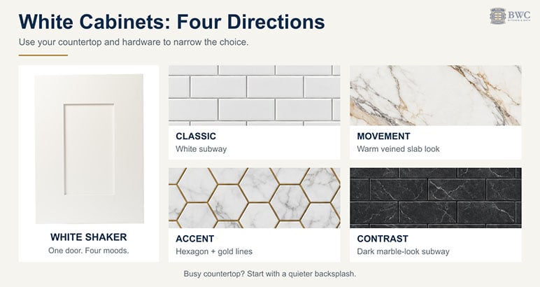
White cabinets give you more freedom than any other color, which is exactly why they are the hardest to decide on. Four directions work, and the countertop usually tells you which one to pick:
Classic: white or off-white subway tile with a soft grey grout. The lowest-risk choice, and the right one if your countertop is busy.
Movement: marble-look subway or a Calacatta-look slab with warm veining. Match the slab to the countertop for the seamless look.
Accent: white marble hexagon with gold accent lines, if your hardware or faucet is brass or gold.
Contrast: a dark marble-look subway or charcoal tile, which turns the backsplash into the statement wall.
With white cabinets and white countertops, add interest through veining, texture, or grout color rather than a second strong color. And if your white door is a detailed raised panel like Charleston White, stay with the classic or movement options: a quiet tile run keeps the door the focus.
The Backsplash Mistakes That Date a Kitchen
Clashing grout color. Why it fails: it draws heavy attention to the grid pattern or washes out the look. The fix: match grout to one of the tile's secondary tones, or, if using metallic accent lines, match them to your hardware finish.
Busy backsplash plus detailed doors. Why it fails: the elements compete for attention and look visually exhausting. The fix: pair raised-panel or detailed doors with a quiet, tonal tile run.
Trend-chasing mosaics. Why it fails: materials like mirror tile or bright printed glass mosaic date instantly. The fix: get pattern from real stone in classic layouts (hexagon, herringbone, chevron, arabesque) that have worked for decades.
Ignoring the countertop. Why it fails: busy granite under busy tile creates confused chemistry. The fix: busy counter, simple backsplash. Calm counter, the backsplash can lead.
How to Choose: A Simple Decision Framework
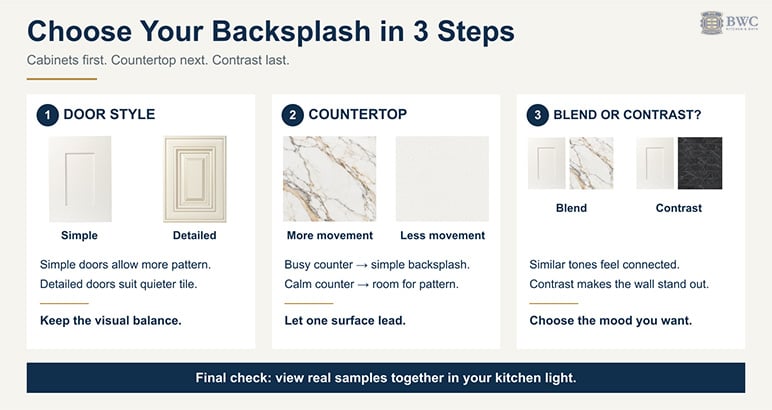
If you are stuck, answer these three questions:
1. Are your cabinet doors simple or detailed? Simple doors (Shaker, slim Shaker, flat-panel, high gloss slab) can handle a bolder backsplash: a veined slab, a metallic-accent hexagon, a herringbone or chevron mosaic. Detailed doors like Charleston White raised panels need a quiet one.
2. Is your countertop busy or calm? Busy counter, simple backsplash. Calm counter, you have more freedom. If you want a full-height veined slab behind the range, keep the countertop veining subtle, or match slab to counter for the seamless look.
3. Do you want the backsplash to blend or contrast? Blending (white cabinets, white-and-gold slab) makes a small kitchen feel bigger. Contrasting (White Shaker with dark marble subway, or Black Shaker with a light slab) adds drama but needs enough square footage to pull off.
And settle the pairing with the real thing, not a screen. A sample door ships free and typically arrives within 2 to 4 days. Holding the actual door against tile samples answers the pairing question faster than any photo.
Frequently Asked Questions
What is the most timeless backsplash choice?
White or off-white subway tile in a 3x6 brick layout. It has been used in kitchens since the early 1900s and pairs with virtually every cabinet color, from Navy Blue Shaker to natural oak. If you want more character without losing longevity, choose a marble-look subway with soft veining.
What is the best type of backsplash for a kitchen?
For most kitchens, glazed ceramic or porcelain tile. It resists heat, grease, and water, cleans with soap and water, and comes in every look from plain subway to marble-look slabs. Natural stone and wood are beautiful but need more care behind a cooktop.
Should the backsplash be lighter or darker than the countertop?
Either works, as long as there is a clear difference or a deliberate match. A lighter backsplash keeps a kitchen open and bright, especially with dark cabinets or a dark counter. A darker backsplash can work over a light countertop as a statement wall. What looks wrong is a backsplash that is almost, but not quite, the same tone as the counter.
Does the backsplash need to match the countertop?
It does not need to match exactly, but it should not clash. Pull one of the secondary tones from your countertop into your backsplash tile or grout color. The exception is the full-slab look, where backsplash and countertop are cut from the same material. That deliberate match makes the kitchen feel larger and more custom.
What is the current trend in backsplash?
The direction is toward fewer grout lines and more stone: full-height slabs, marble-look porcelain, and elongated tile in herringbone or vertical stacks. Patterned mosaics are moving from printed tile to real stone in classic layouts.
Are hexagon tiles with gold accents going out of style?
Not soon. The hexagon shape is a hundred-year-old classic, and the brass-accent version is a current expression of it. Treat the metallic joints as a 10-year look and match them to your hardware finish. For maximum longevity, use the same hexagon with tone-matched grout instead.
Is peel-and-stick backsplash worth it?
For renters or homeowners doing a phased remodel, yes. For a permanent kitchen renovation, no. Real tile lasts for decades with basic care. Peel-and-stick is measured in years: edges can lift and adhesive can degrade, especially near heat and steam.
Should the backsplash go all the way to the ceiling?
In kitchens with no upper cabinets on a wall, running tile or a slab to the ceiling creates a finished, intentional look. We do this behind range hoods in many of our designs. Between upper and lower cabinets, the standard is countertop to the bottom of the uppers. Behind a range with a hood, run the tile at least up to the underside of the hood.
Where should the backsplash end on an open wall?
End it at a natural line: the outer edge of the countertop, the edge of the upper cabinets, or a window or door casing. If the countertop runs longer than the cabinets, most kitchens stop the tile in line with the countertop edge. Whichever line you choose, finish the exposed tile edge with a bullnose piece or a metal edge trim so it looks deliberate.
Ready to plan the rest of the kitchen? Order a sample door to test your pairing, or browse the full kitchen cabinets catalog. Our RTA cabinets ship flat in 7–10 business days nationwide, at up to 40% less than big-box pricing.
Wholesale support: 469-898-8077 | [email protected]